
Financial Blog
Investment Comparison: Lump Sum VS Dollar Cost Averaging
Kris Alban | Feb 03 2025 19:00
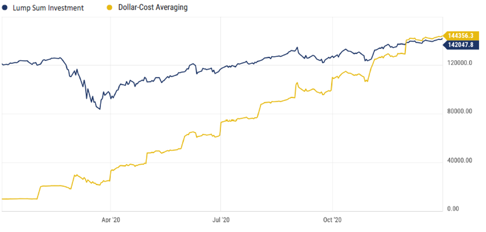
Do you have some extra cash you want to invest, but not sure if this is a good time to go "all-in"? Well, here's a chart that demonstrates how two different approaches might work out.
See that blue line labeled "Lump Sum Investment"? That's what would have happened if you went all-in with $120k at the beginning of 2020. The yellow line, "Dollar-Cost Averaging," shows the slow and steady approach – $10k each month. Notice how the blue line had a bit of a dramatic dip around March 2020? That's the market being its usual charming self. The yellow line? Less of a heart-stopping plunge.
This chart illustrates how consistently buying over time could lead to a similar outcome without dealing with the volatility. But that mid-2020 dip might have caused some folks (you know who you are) to sell low and miss the eventual rebound. The yellow line folks? They just kept calmly buying, like they were on a very methodical shopping spree during a chaotic flash sale.
No guarantees here, of course (the SEC insists). But this chart shows how spreading your buys can smooth out the ride and possibly even give you an edge over trying to time the perfect entry point.
If you have questions about your investments, or just want a second set of eyes on your strategy, contact us to schedule a call.